Anyway.
Each of the teams that will be playing in the volleyball tournament is supposed to have a team name and logo for their shirts, and the logos were supposed to be designed by this graphics dude up at corporate. But apparently he got his butt fired about a week and a half ago, before actually doing any of that pesky team logo work. So, since I tend to be more on the creative side than most of the folks around here I got tagged with the responsibility of designing/creating the team logos.
This has been a gas. Lately, my opinion of my job (technical writing, a.k.a. information design and development) vascillates wildly between general boredom (when I'm doing the technical writing) and out-and-out loathing (when I'm forcing my way through a frustrating array of "busy work" that involves all varieties of writing that gets shoved at me when I'm in a lull -- not technical writing, but often other types of technically-oriented marketing and sales collateral, none of which is my exactly part of my job or even my forte, but none of which anyone else here wants to/knows how to do...). So getting a chance to stretch out a bit creatively, even on quick turnaround work like this, is pretty invigorating.
Anyway, I thought I'd share the logos I came up with. These are largely from scratch ideas -- aside from a team name and the occasional "how about something like ...." rough idea I didn't really have much input from the teams on whart they had in mind. I'm happy with the variety of styles I worked up. They all have, by design, a cartoony "line art" quality since these will be screen printed onto t-shirts and can have no more than 4 colors plus a "clear" color (i.e. the shirt color).
First, the "APC Dream Team":
 (I work for APC. This is not my team, though...). Next up, "The Fighting Sugar Bushes" (a reference to this...). The base image was a cute widdle fuzzy wuzzy squirrel holding an acorn that I found in an online kid's coloring book. I just ... evil-ed it up a bit.
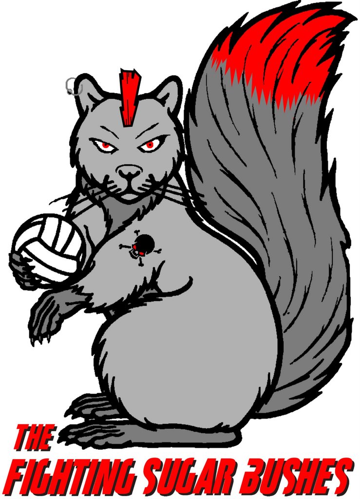 The Giraffes (kind of a lame team name, but I like the look of the logo):
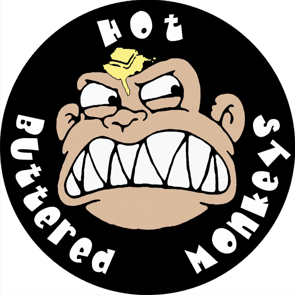
The Hot Buttered Monkeys -- this is my team. Long story on the name, and it's not even particularly funny. But it makes a great graphic. Face lifted from a Family Guy screen capture I found during an image search. I don't watch Family Guy very much -- is this character frequently featured?
 Next, the unofficial winner for Most God-Awful Poor Pun in a Team Name: "To Kill a Blocking Nerd." Ugh to the team name, but I like the image quite a but.
 And now, I tempt the gods of trademark and copyright a bit (although since none of this is earning anyone any money, and it all falls safely under parody, I think I'm safe....) with "Over One Billion Served":
 And finally, "Power Spikes." Went for a sort of "propaganda style" here....
 All in all, solid stuff I'd say. Opinions welcome.
Mood: Beat (spent all day in the sun at Sea World yesterday)
Now Playing: Kate Bush, "Aerial"
1 comment:
Loved the team logos. Came here from Ray's blog: I should have known that any friend of his would be twisted.
Post a Comment